Tuesday 25 September 2012

Photography;

looking at the work of Photographers...

Annie leibovitz

Click to view full size image

This photograph is staged; I feel that it is meant to reflect juxtaposition between the glamorously dressed women (Quen Stefani) and the back street with motorcycles on the road. I like this photograph because the colour palette has been considered and thought out well even down to the reflection colour that the light gives. The composition on the women makes her seem very powerful with out being dominating. The way that the photograph has been composed makes it clear that Annie intended people to look at the whole mes en scene.


Robert Doisencau


This photograph has a warm charm to it. The composition draws you in the loving couple and the bike in the background. The couple being off centre again allows the view to consider the whole mes en scene, this in return gives the viewer more enigma codes to read about the couples relationship.

Richard Avedon


This photograph captures a very intimate and private moment for women. It highlights the concentration and the amount of time it takes to maintain vanity as women. Composition of the photograph makes it clear that Richard intended for the women to be the focus point of the photograph because it is capturing her beauty.


Fay Godwin


The movement that Fay captures in this photograph is what draws me to it. The bright light makes the land seem all the more powered by the sky. I like the contrasting central line that flows through the photograph of the very hard dark house/ building.

Sally Mann


Sally captures the attitudes of the young girls. The young girls seem to have been represented as mischievous and strong willed. The way that the girl in this photograph doesn't look at the camera captures a character who doesn't seem phased by the camera. I like that the creature she is holding covers her nude body.  

Corinne Day


The Face Kate Moss Corinne Day


I like that Corinne's photographs completely captures the personality of the models. She doesn't have rehearsed poses in front of her. This photograph of Kate Moss laughing seems very genuine and as though this is how Kate should be represented as a beauitful person but a real character behind the beauty.

Thursday 20 September 2012

Final out come:

Illustrations/ studies from observation of birds.

This is a quick 5minute study of a cockerel. I like the effect of   continuous line drawings because it gives the double line marks have depth and shadow. 


This drawing has got a lot of different drawing techniques in it like; continuous line drawings, left/right hand drawings and drawings where you only look at the subject you are working from drawings. I like the variety of the marks made and how they contrast each other when they overlap. 
These drawings are drawn with a variety of pencil/ charcoal thicknesses and stick lengths. The denser the material used was the more i focused on the bigger shapes within the bird. I feel that this combination of thicknesses in the material gives the effect of movement.
In this drawing I used the same concepts as the two above. this time I used ink and sticks but also focused on the negative space.

6 illustrators who's work inspires me...
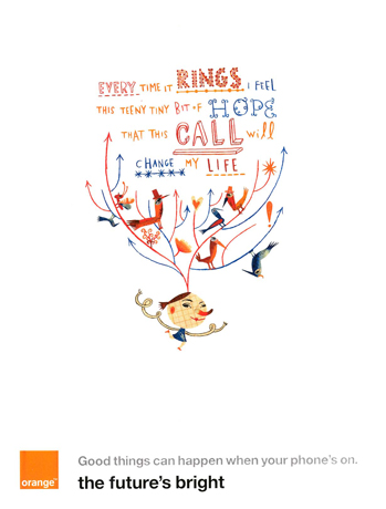

Cheonique Hilsaca:

Overactive MindMixed Media


I like the playful nature of Cheonique's work. The illustration style she has used works affectively because it is very clear. I feel that both the limited colour pallet and the composition help the image to be clear, but stimulating to look at.
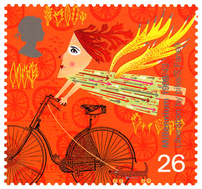
Chris Thornley

Angels from Hell

I like Chris's work because of the way that the illustrations are composed on the pieces. The excessive use of negative space with part of the main image cropped works well because it adds mystery to the character on the bike. I also like the reflective parts to the bike that are contrasted with dense and dark shapes.


Fredrick Akum


frederikakum_big

I like Fredrick’s work because of the layers of shade and detail that he has built up from three main colours. I think that the painting has been composed well to make people look up into the supposed distance.

Josh Bryan

joshbig

Josh's work appeals to me because his use of geometric shapes. The lines and triangles are constructed to make the face of the icon Marilyn Monroe. The variations of the space between the lines on the trianlgles make this illustration have depth.


Heather Lund

heather-lund

Heather's work interests me because I like the simple shapes that the owl is composted of. I think that the illustrations character has come across through the use of the colour blue that makes the owl seem wise and the cork board background also supports this.

Gabee Meyer

mowks
This piece of work is very colourful and fun. The busy pattern and amounts of colours used is compensated for by the very plain background. I like this illustration because I feel that it represents a perception of life, music and living.

Tuesday 18 September 2012

David Hughes

Illustrator

I like Davids variations of ink lines. They help bring different qualities to his characters through the length and thickness of them. The illustrations remind me of caricatures.
stravinksy rite the new yorker 2009

Sara Fanelli

illustrator

I like Sara's work because she uses a limited colour pallete that gives character to her illustrations. The royal mail stamp has a very summery, happy ora to it which makes it appealing. The use of the arrows on the Angels dress brings a sense of movement. This movement is also reflected in the Angels wings and the small dog running. The image looks appealing to all age ranges because of Sara's use of collage.
Royal Mail stamp

Orange press ad

Sunday 16 September 2012

Chris Edmunds

 Eskimo creative


 Jessica Hische


Roger Excoffon

 Eduardo Aires Design 


Art Deco, Colecção Barardo


Maria Jarema


To the letter.

By Paul shaw from eye magazine 75 spring 2010


 'To the letter' explores the work of two calligraphers, Carl Kurtz and Susan Skarsgard. Carl and Susan both use text as tool to create beautiful images, often putting the form of the letters before the legibility of the text. The article talks briefly about the history of the calligraphers, and also compares thier achievements to Asian art, where the beauty of calligraphy is much more common in the culture. The letters are 'drawn, rather than written'. The writer then goes on to discuss how it is clear that in Kurtz's vision, the image is dominant, and 'the legibility is often a casualty as he distorts and manipulates the letters.' He also includes an explanation of Skarsgard's alphabets, discussing her play with fundamental shapes of the alphabet and stripping them down to explore shape, rhythm, negative space, pattern, colour, texture and perception. This process often ends with illegibility, but Skarsgard suggests that in modern society expression is a much more vital ingredient in the calligraphy world than being able to read it.

Graphic design final outcomes.


Brief:

Create a series of 4 A4 images that communicate your interpretations of a selection of words. You will choose 4 words and explore a range of interesting ways to visualise how the word behaves.

Using a range of techniques and image-making processes that specialist tutor/s will introduce, you will create designs that involve elements of type (letters), line, photography and a limited colour palette.

To get from our briefing to the final product I had to understand what each of my four words mean. I created a mind map to create a collection of moods, analytics, sounds and relative words. This helped the next part of my process where I created a mood board with colours and shapes that I felt correspond well with each word.

now I had got my inspiration I was able to create six thumbnail design possibilities for the way I would compose each word.

Isolation      

 Cascade


Collapse


Balance


Creating images that reflect a word. 

Isolation


Collapse

Balance


Cascade